Allergy Alert
Allergy Alert
Allergy Alert
PRODUCT DESIGN (UI/UX)
PRODUCT DESIGN (UI/UX)
PRODUCT DESIGN (UI/UX)

What is Allergy Alert?
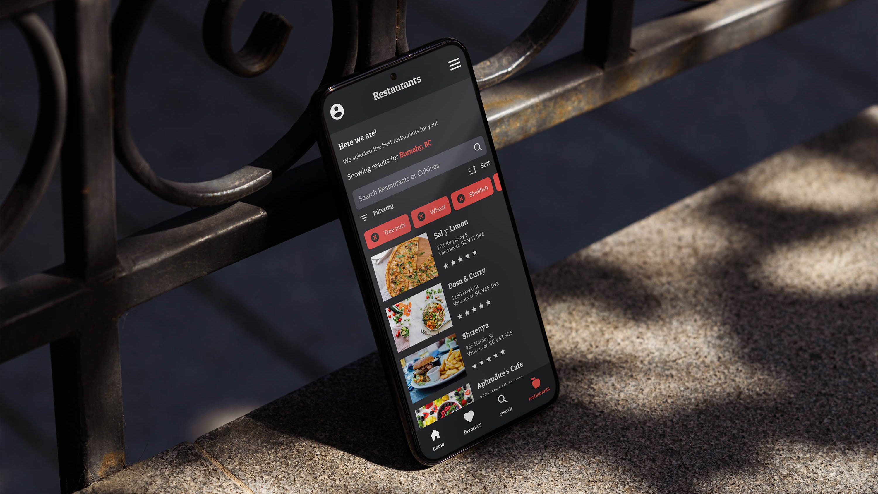
Allergy Alert is a fictional app project that I worked on in my Usability Design course at BCIT alongside a group of three others. The purpose of the assignment was to create an app that solves a real-world problem, and because I live with severe food allergies, this seemed like a great project to be a part of.
The purpose of the app is to allow allergy-sensitive customers to find restaurants that will safely accommodate their needs.
Market Gap
To our surprise, there are no current market competitors for this kind of app aside from one American company called Allergy Eats. They are US only and their services are restricted to only a small number of states.
Our goal was to create a very simple app with the goal of helping customers eat safe no matter where they are in the world.
Design Process
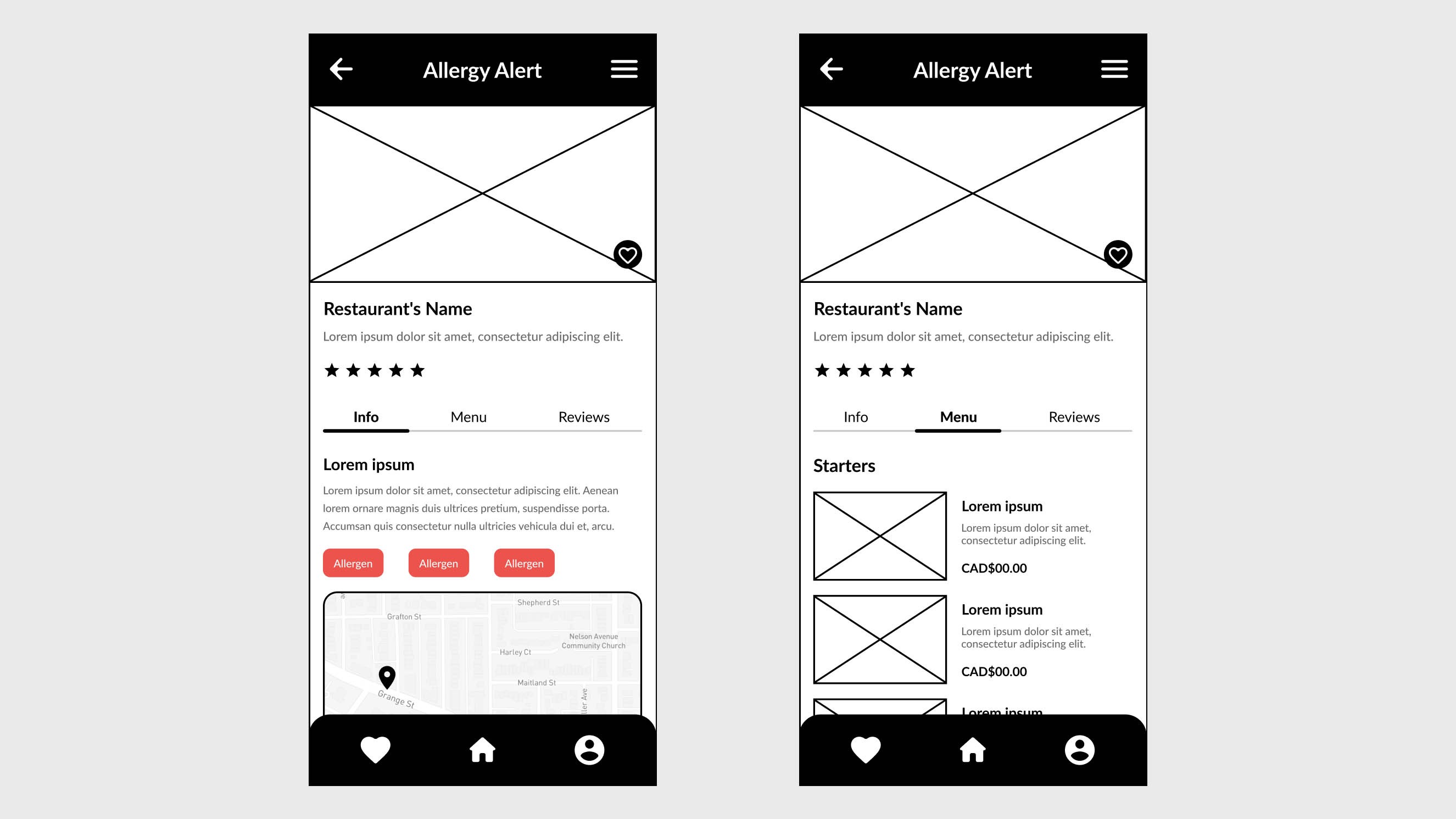
When designing the layout for this app, we wanted to make it as simple and intuitive as possible to allow for the best user experience. We made sure the important features were laid out in a format that was consistent to the mental model our target audience would have for other popular food-related apps.
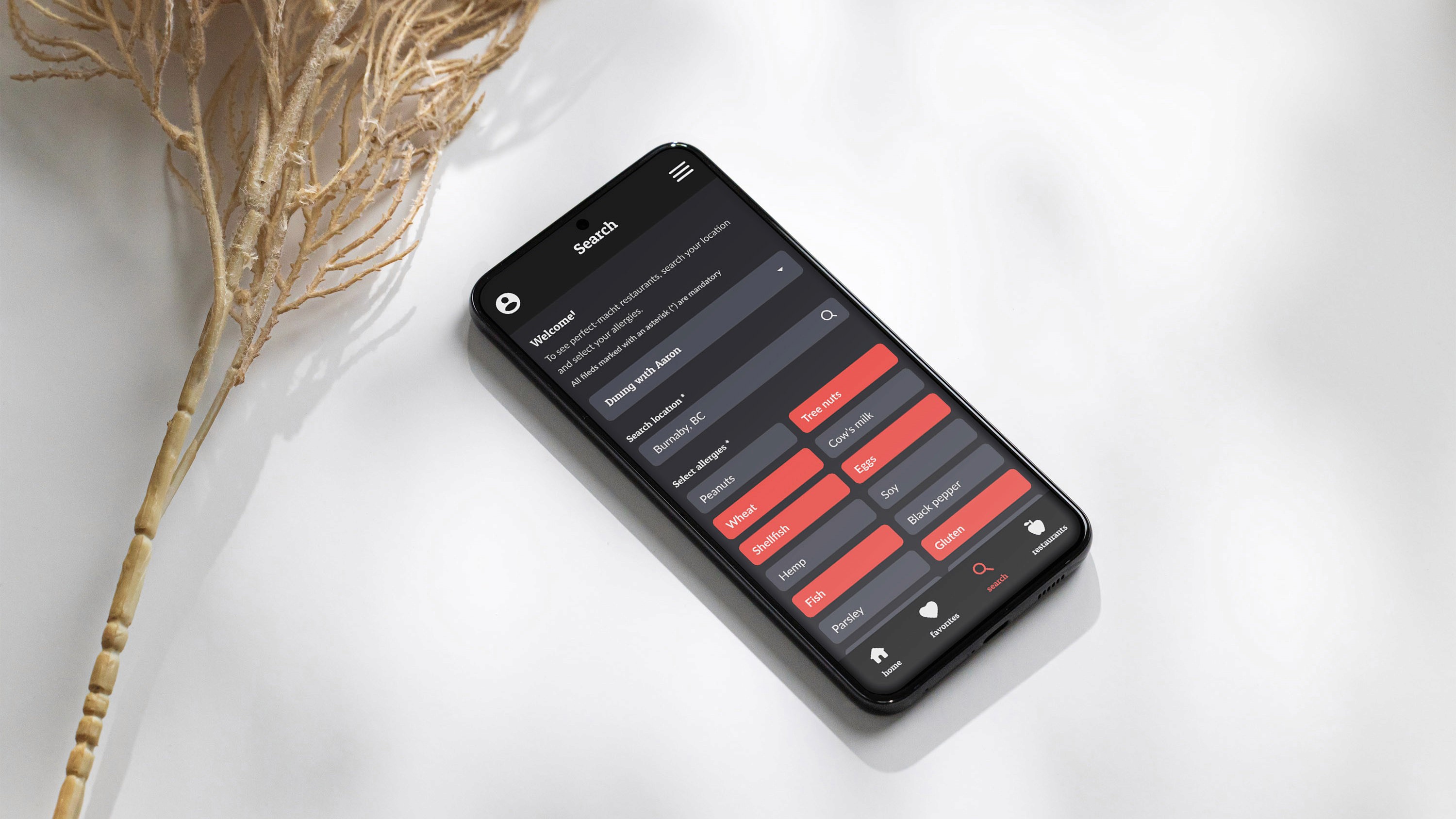
The primary red colour was chosen specifically as a bright contrasting colour which signifies "warning" as the app's name suggests. We made sure to choose a slightly softer, desaturated red hue to avoid harsh visual contrast in our user interface.


What is Allergy Alert?
Allergy Alert is a fictional app project that I worked on in my Usability Design course at BCIT alongside a group of three others. The purpose of the assignment was to create an app that solves a real-world problem, and because I live with severe food allergies, this seemed like a great project to be a part of.
The purpose of the app is to allow allergy-sensitive customers to find restaurants that will safely accommodate their needs.


Market Gap
To our surprise, there are no current market competitors for this kind of app aside from one American company called Allergy Eats. They are US only and their services are restricted to only a small number of states.
Our goal was to create a very simple app with the goal of helping customers eat safe no matter where they are in the world.
Design Process
When designing the layout for this app, we wanted to make it as simple and intuitive as possible to allow for the best user experience. We made sure the important features were laid out in a format that was consistent to the mental model our target audience would have for other popular food-related apps.
The primary red colour was chosen specifically as a bright contrasting colour which signifies "warning" as the app's name suggests. We made sure to choose a slightly softer, desaturated red hue to avoid harsh visual contrast in our user interface.


What is Allergy Alert?
Allergy Alert is a fictional app project that I worked on in my Usability Design course at BCIT alongside a group of three others. The purpose of the assignment was to create an app that solves a real-world problem, and because I live with severe food allergies, this seemed like a great project to be a part of.
The purpose of the app is to allow allergy-sensitive customers to find restaurants that will safely accommodate their needs.


Market Gap
To our surprise, there are no current market competitors for this kind of app aside from one American company called Allergy Eats. They are US only and their services are restricted to only a small number of states.
Our goal was to create a very simple app with the goal of helping customers eat safe no matter where they are in the world.
Design Process
When designing the layout for this app, we wanted to make it as simple and intuitive as possible to allow for the best user experience. We made sure the important features were laid out in a format that was consistent to the mental model our target audience would have for other popular food-related apps.
The primary red colour was chosen specifically as a bright contrasting colour which signifies "warning" as the app's name suggests. We made sure to choose a slightly softer, desaturated red hue to avoid harsh visual contrast in our user interface.
